
Seeing a new monarch ascending to the throne is quite a big occasion. In fact, it is something very few of us have ever witnessed. So, designing a suitable batch of coins to symbolise this is no easy task.
Enter Harrie. Okay, he has been undeniably responsible for a good few cracking designs since turning his hand to TGBCH coin production, but this was something else. He had been assigned this job and he really did need to get it right. Coronation coins were destined to be in high demand, so the pressure was most certainly on.

Fortunately for all at TGBCH, Harrie gave this matter some careful consideration. Rather than over-complicating things, he opted for clean, crisp designs. Sure, the three featuring the coronation logo (my personal favourites) may contain plenty of detail, but he has managed to maintain a wholly uncluttered look to each. This trio are full of beautiful colours, but it is the plain white background which really makes them so striking.

For his other designs he has chosen to use the official crests and monograms. Again, the colours he has chosen make them appealing from the off and they all have an air of….. well, royalty about them.
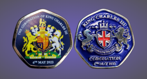
Going on these latest ‘done by our Harrie’ releases, it is pretty clear he has mastered one of the most important rules of all in coin design – simplicity usually works best. So, he was given a mission and has passed with flying and very well chosen colours. Well done Harrie. Some of your finest to date I think 🙂
© Article and images copyright Mik Smith 2023
